Collected Jewellery Brand Design
We were asked to rebrand from quite a dated logo, which was fast becoming lost in such a competitive industry.
The Collected range of jewellery is both vintage and antique, but it is aimed towards a more modern & hip market.
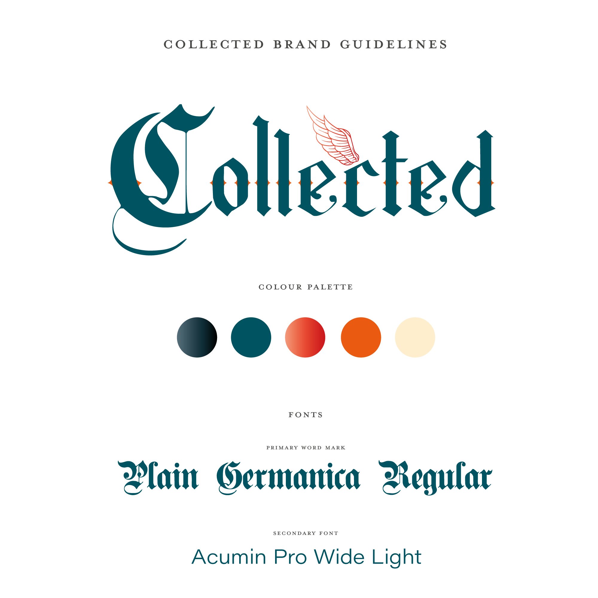
We chose a very historic font for the main word mark using an antique colour palette with very hot coral red splashed in as the accent and wing colours, giving the brand an unmistakable edgy look, drawing the younger & cooler crowds in their droves!
Branding
Icons
Monogram
Packaging
Signage


